How to Add a Dark Mode Switcher to Your Alpine.js and Tailwind CSS App
Enhance your application's user experience by seamlessly integrating a dark mode feature using Alpine.js and Tailwind CSS.
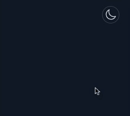
Demo GIF
Why Implement Dark Mode
Incorporating a dark mode into your application offers numerous benefits that enhance user experience and accessibility:
User Preference
- Aesthetic Appeal: Many users favor dark mode for its sleek and modern look.
- Reduced Eye Strain: Especially in low-light settings, dark mode minimizes eye fatigue, making prolonged usage more comfortable.
Battery Efficiency
- Energy Savings: On OLED and AMOLED screens, dark mode can significantly extend battery life by decreasing the number of bright pixels displayed.
Accessibility
- Enhanced Readability: Offering both light and dark themes caters to users with visual impairments, ensuring better contrast and readability.
- Inclusive Design: Providing multiple theme options makes your application more accessible to a diverse user base.
Requirements
Before diving into the implementation, ensure you have the following set up:
- Tailwind CSS: Initialize Tailwind CSS in your project by following the official installation guide.
- Alpine.js: Integrate Alpine.js into your project by following the official installation instructions. You can include it via CDN or install it using npm.
Step-by-Step Implementation
1. Tailwind CSS Configuration
To enable dark mode using the 'class' strategy, you'll need to update your tailwind.config.js file. This approach allows you to manually toggle dark mode by adding or removing the dark class on a parent element, typically the tag.
Update tailwind.config.js
Open tailwind.config.js: Locate and open your project's tailwind.config.js file.
Configure Dark Mode: Set the darkMode property to 'class'. This configuration enables manual control over dark mode by toggling the dark class.
// tailwind.config.js
export default {
  darkMode: 'class', // Enables manual dark mode toggling
  // ...
}
Explanation:
darkMode: 'class': This setting tells Tailwind CSS to apply dark mode styles when the dark class is present on a parent element.
2. Add the Dark Class to Your HTML Template
To activate dark mode by default or based on user preference, add the dark class to the element in your HTML template.
<!doctype html>
<html lang="en" class="dark">
  <head>
    <meta charset="utf-8">
    <meta http-equiv="X-UA-Compatible" content="IE=edge">
    <meta name="viewport" content="width=device-width, initial-scale=1">
    <title>Your Site Title</title>
    <!-- Your other head elements -->
  </head>
  <body class="bg-white dark:bg-gray-900 dark:text-gray-300 font-sans leading-normal text-gray-800 px-4 sm:px-10">
    <!-- Your site content -->
  </body>
</html>
Explanation:
class="dark"on<html>: Adding thedarkclass to the<html>tag activates dark mode styles throughout your application.- Tailwind Utility Classes:
bg-white dark:bg-gray-900: Sets a white background in light mode and a dark gray background in dark mode.dark:text-gray-300 text-gray-800: Sets dark gray text in dark mode and darker gray text in light mode.
Note: Initially adding the dark class sets the default theme to dark mode. To allow users to toggle between light and dark modes, you'll manage this class dynamically using JavaScript or Alpine.js in subsequent steps.
3. HTML Template Modifications
To ensure that your application respects the user's theme preference from the moment the page loads, you'll need to integrate an inline script within your HTML. This script is crucial for applying the user's selected theme immediately, thereby preventing any unwanted flashes of incorrect styling (FOUC).
<!doctype html>
<html lang="en" class="dark">
  <head>

    <!-- Inline Script to Apply Theme -->
    <script>
      (function() {
        const theme = localStorage.getItem('theme') || 'system';
        const isSystemDark = window.matchMedia('(prefers-color-scheme: dark)').matches;

        // Apply the dark class to prevent FOUC
        if (theme === 'dark' || (theme === 'system' && isSystemDark)) {
          document.documentElement.classList.add('dark');
        } else {
          document.documentElement.classList.remove('dark');
        }

        // Store the initial system preference
        localStorage.setItem('isSystemDark', isSystemDark);

        // Listen for system theme changes
        window.matchMedia('(prefers-color-scheme: dark)').addEventListener('change', (event) => {
          localStorage.setItem('isSystemDark', event.matches);
          if (theme === 'system') {
            document.documentElement.classList.toggle('dark', event.matches);
          }
        });
      })();
    </script>

    <!-- Your compiled CSS & JS file goes here -->

    <!-- Alpine JS CDN goes here -->
    <script src="//unpkg.com/alpinejs" defer></script>
  </head>
  <body>
	<!-- Content goes here -->
  </body>
</html>
What This Code Does
-
Retrieve User Preference:
- Functionality: The script first checks
localStoragefor a saved theme preference ('light','dark', or'system'). - Fallback: If no preference is found, it defaults to 'system', meaning the application will follow the system's current theme setting.
- Functionality: The script first checks
-
Determine System Theme:
- Functionality: Utilizes the
window.matchMediaAPI to detect if the user's operating system prefers a dark color scheme. - Result: Stores this preference in the
isSystemDarkvariable as a boolean (true if the system is in dark mode, false otherwise).
- Functionality: Utilizes the
-
Apply Dark Mode Class:
- Functionality: Based on the retrieved theme and system preference, the script adds or removes the dark class on the element.
- Purpose: Ensures that the correct theme styles are applied before the CSS fully loads, effectively preventing a Flash of Unstyled Content (FOUC).
-
Store System Theme Status:
- Functionality: Saves the system's dark mode status (
isSystemDark) inlocalStorage. - Purpose: Allows the application to remember the system preference across browser sessions and page reloads, ensuring consistency in theme application.
- Functionality: Saves the system's dark mode status (
-
Listen for System Changes:
- Functionality: Sets up an event listener using window.matchMedia to detect any changes in the system's color scheme preference.
- Action on Change: If the user has selected 'system' mode, the script automatically updates the application's theme by toggling the dark class on the element based on the new system preference.
- Purpose: Keeps the application's theme in sync with the system's theme settings in real-time, enhancing user experience without requiring manual intervention.
4. Add the Darkmode Drop Down Selector to Your Page
The following code snippet adds a dropdown selector that allows users to toggle between Light Mode, Dark Mode, and System Mode. This switcher uses Alpine.js for state management and interactivity.
<div class="relative"
     x-data="{
        dropdownOpen: false,
        theme: localStorage.getItem('theme') || 'system',
        isSystemDark: localStorage.getItem('isSystemDark') === 'true',
        init() {
            // Watch for system dark mode changes
            const mediaQuery = window.matchMedia('(prefers-color-scheme: dark)');
            this.isSystemDark = mediaQuery.matches;
            mediaQuery.addEventListener('change', (event) => {
                this.isSystemDark = event.matches;
                if (this.theme === 'system') {
                    this.updateTheme();
                }
            });

            // Set the initial theme
            this.updateTheme();
        },
        updateTheme() {
            const isDark = this.theme === 'dark' || (this.theme === 'system' && this.isSystemDark);
            document.documentElement.classList.toggle('dark', isDark);
        },
        setTheme(newTheme) {
            this.theme = newTheme;
            localStorage.setItem('theme', newTheme);
            this.updateTheme();
            this.dropdownOpen = false; // Close dropdown after selection
        },
        currentIcon() {
            if (this.theme === 'light') return 'light';
            if (this.theme === 'dark') return 'dark';
            return 'system'; // For 'system', decide based on system preference
        },
        systemIconColor() {
            return this.isSystemDark ? 'dark' : 'light';
        }
    }"
     x-init="init"
     @click.away="dropdownOpen = false"
>
    <!-- Trigger Button -->
    <button
            @click="dropdownOpen = !dropdownOpen"
            class="p-1 border dark:border-gray-700 rounded-full hover:bg-gray-50 dark:hover:bg-gray-800 text-gray-700 dark:text-gray-300">
        <!-- Dynamic Icons -->
        <template x-if="currentIcon() === 'light'">
            <svg xmlns="http://www.w3.org/2000/svg" class="w-6 h-6 text-yellow-500" fill="none" viewBox="0 0 24 24" stroke-width="1.5" stroke="currentColor">
                <path stroke-linecap="round" stroke-linejoin="round" d="M12 3v2.25m6.364.386l-1.591 1.591M21 12h-2.25m-.386 6.364l-1.591-1.591M12 18.75V21m-4.773-4.227l-1.591 1.591M5.25 12H3m4.227-4.773L5.636 5.636M15.75 12a3.75 3.75 0 11-7.5 0 3.75 3.75 0 017.5 0z" />
            </svg>
        </template>
        <template x-if="currentIcon() === 'dark'">
            <svg xmlns="http://www.w3.org/2000/svg" class="w-6 h-6 text-blue-500" fill="none" viewBox="0 0 24 24" stroke-width="1.5" stroke="currentColor">
                <path stroke-linecap="round" stroke-linejoin="round" d="M21.752 15.002A9.718 9.718 0 0118 15.75c-5.385 0-9.75-4.365-9.75-9.75 0-1.33.266-2.597.748-3.752A9.753 9.753 0 003 11.25C3 16.635 7.365 21 12.75 21a9.753 9.753 0 009.002-5.998z" />
            </svg>
        </template>
        <template x-if="currentIcon() === 'system'">
            <svg xmlns="http://www.w3.org/2000/svg" :class="systemIconColor() === 'dark' ? 'text-gray-300' : 'text-gray-400'" class="w-6 h-6" fill="none" viewBox="0 0 24 24" stroke-width="1.5" stroke="currentColor">
                <path :d="systemIconColor() === 'dark' ? 'M21.752 15.002A9.718 9.718 0 0118 15.75c-5.385 0-9.75-4.365-9.75-9.75 0-1.33.266-2.597.748-3.752A9.753 9.753 0 003 11.25C3 16.635 7.365 21 12.75 21a9.753 9.753 0 009.002-5.998z' : 'M12 3v2.25m6.364.386l-1.591 1.591M21 12h-2.25m-.386 6.364l-1.591-1.591M12 18.75V21m-4.773-4.227l-1.591 1.591M5.25 12H3m4.227-4.773L5.636 5.636M15.75 12a3.75 3.75 0 11-7.5 0 3.75 3.75 0 017.5 0z'" />
            </svg>
        </template>
    </button>

    <!-- Dropdown Content -->
    <div
            x-show="dropdownOpen"
            x-cloak
            class="absolute origin-top-right right-0 mt-2 py-2 w-48 bg-white dark:bg-gray-800 rounded-md shadow-lg z-10">
        <!-- Light Mode Button -->
        <button
                class="w-full px-4 py-2 text-left text-sm text-gray-700 hover:bg-gray-100 dark:text-gray-300 dark:hover:bg-gray-700 flex items-center gap-2"
                @click="setTheme('light')">
            <!-- Light Mode Icon -->
            <svg xmlns="http://www.w3.org/2000/svg" class="w-5 h-5" fill="none" viewBox="0 0 24 24" stroke-width="1.5" stroke="currentColor">
                <path stroke-linecap="round" stroke-linejoin="round" d="M12 3v2.25m6.364.386l-1.591 1.591M21 12h-2.25m-.386 6.364l-1.591-1.591M12 18.75V21m-4.773-4.227l-1.591 1.591M5.25 12H3m4.227-4.773L5.636 5.636M15.75 12a3.75 3.75 0 11-7.5 0 3.75 3.75 0 017.5 0z" />
            </svg>
            Light Mode
        </button>

        <!-- Dark Mode Button -->
        <button
                class="w-full px-4 py-2 text-left text-sm text-gray-700 hover:bg-gray-100 dark:text-gray-300 dark:hover:bg-gray-700 flex items-center gap-2"
                @click="setTheme('dark')">
            <!-- Dark Mode Icon -->
            <svg xmlns="http://www.w3.org/2000/svg" class="w-5 h-5" fill="none" viewBox="0 0 24 24" stroke-width="1.5" stroke="currentColor">
                <path stroke-linecap="round" stroke-linejoin="round" d="M21.752 15.002A9.718 9.718 0 0118 15.75c-5.385 0-9.75-4.365-9.75-9.75 0-1.33.266-2.597.748-3.752A9.753 9.753 0 003 11.25C3 16.635 7.365 21 12.75 21a9.753 9.753 0 009.002-5.998z" />
            </svg>
            Dark Mode
        </button>

        <!-- System Mode Button -->
        <button
                class="w-full px-4 py-2 text-left text-sm text-gray-700 hover:bg-gray-100 dark:text-gray-300 dark:hover:bg-gray-700 flex items-center gap-2"
                @click="setTheme('system')">
            <!-- System Mode Icon -->
            <svg xmlns="http://www.w3.org/2000/svg" fill="none" viewBox="0 0 24 24" stroke-width="1.5" stroke="currentColor" class="w-5 h-5">
                <path stroke-linecap="round" stroke-linejoin="round" d="M9 17.25v1.007a3 3 0 01-.879 2.122L7.5 21h9l-.621-.621A3 3 0 0115 18.257V17.25m6-12V15a2.25 2.25 0 01-2.25 2.25H5.25A2.25 2.25 0 013 15V5.25m18 0A2.25 2.25 0 0018.75 3H5.25A2.25 2.25 0 003 5.25m18 0V12a2.25 2.25 0 01-2.25 2.25H5.25A2.25 2.25 0 013 12V5.25"></path>
            </svg>
            System Mode
        </button>
    </div>
</div>
Overview of the Dark Mode Dropdown Selector
The following code implements a dark mode switcher using Alpine.js and Tailwind CSS. This switcher allows users to toggle between Light Mode, Dark Mode, and System Mode, providing a seamless and user-friendly experience. Here's a breakdown of what the code does and why each part is essential.
What It Implements
State Management
Alpine.js Component:
- Purpose: Manages the state of the theme (
light,dark,system) and controls whether the dropdown menu is open (dropdownOpen). - Functionality: Utilizes reactive data properties to ensure that changes in the theme state automatically reflect in the UI.
Reactive Data:
theme: Tracks the current theme preference, retrieved from localStorage or defaults to 'system'.isSystemDark: Determines if the system's theme preference is dark, based on localStorage and media queries.dropdownOpen: Controls the visibility of the dropdown menu for theme selection.
Persistent Preferences:
- localStorage:
- Functionality: Stores the user's theme preference (
theme) and the system's dark mode status (isSystemDark). - Benefit: Ensures that the user's selection persists across browser sessions and page reloads, providing a consistent experience.
- Functionality: Stores the user's theme preference (
Dynamic Icons
- Visual Feedback:
- Icons: The switcher displays different icons (sun for light mode, moon for dark mode, and a neutral system icon) based on the current theme selection.
- Color Highlights: Light and dark modes feature color highlights (yellow for light, blue for dark) to indicate active selection. System mode displays a neutral icon without highlights, signaling that the theme is controlled by system settings.
Dropdown Menu
- User Control:
- Options: Provides clear options for users to select their preferred theme mode—Light, Dark, or System.
- Accessibility: Designed to be intuitive and accessible, ensuring that all users can easily navigate and select their desired theme.
Default to System Mode
-
System Integration:
- Default Setting: The switcher defaults to the system's theme preference ('system'), aligning the application's appearance with the user's device settings.
-
Dynamic Adaptation:
- Real-Time Updates: If the system's theme changes and the user is in system mode, the application automatically updates the theme without requiring any additional user action.
Explanation of Alpine.js Directives and Methods
To fully understand how Alpine.js manages the dark mode functionality, let's break down the key directives and methods used in the dropdown switcher component.
x-data: Initializes the component's reactive state, includingdropdownOpen,theme, andisSystemDark.x-init="init": Calls theinitmethod when the component is initialized, setting up initial theme preferences and event listeners.@click.away="dropdownOpen = false": Closes the dropdown when a click occurs outside the component.
Methods:
init(): Sets up media query listeners to detect system theme changes and applies the initial theme.updateTheme(): Toggles the dark class on the element based on the current theme and system preference.setTheme(newTheme): Updates the theme, stores the preference in localStorage, and closes the dropdown.currentIcon(): Determines which icon to display based on the current theme.systemIconColor(): Sets the color of the system icon based on the system's theme preference.
Visual Flow
Initial Load
-
Theme Initialization:
- Check
localStorage: On page load, the component checkslocalStoragefor any saved theme preference. - Default to System: If no preference is found, it defaults to 'system', adopting the system's current theme.
- Check
-
Apply Theme:
- Toggle
darkClass: Based on the determined theme, the dark class is added or removed from the element to apply the appropriate styles, preventing any Flash of Unstyled Content (FOUC).
- Toggle
User Interaction
-
Toggle Dropdown:
- Button Click: When the user clicks the trigger button, the dropdown menu toggles open or closed, allowing access to theme selection options.
-
Select Theme:
- Choose Mode: Selecting a mode (
'light','dark', or'system') updates the theme state, saves the preference to localStorage, and closes the dropdown menu.
- Choose Mode: Selecting a mode (
-
Icon Update:
- Dynamic Icons: The switcher icon updates to reflect the selected theme, providing immediate visual feedback to the user.
System Theme Changes
- Listen to Changes:
- Media Query Listener: The component listens for changes in the system's color scheme using the window.matchMedia API.
- Automatic Update:
- System Mode Active: If the user is in 'system' mode and the system's theme changes, the application automatically updates the theme to match the new system preference.
5. Test Theme Toggling:
- Use the dark mode switcher to toggle between
light,dark, andsystemmodes. - Refresh the page to verify that the selected theme persists.
- Switch your system's theme settings and ensure the application responds accordingly when in system mode.
- Resize your browser or test on different devices to ensure the dark mode feature works consistently across various screen sizes.
- Reload the page multiple times to ensure that the inline script effectively prevents any flash of the wrong theme (FOUC).
- Check Styling Consistency: Browse through various sections to ensure consistent styling and design for both light mode and dark mode.
Conclusion
Implementing a dark mode selector in your Alpine.js and Tailwind CSS application not only modernizes your user interface but also caters to user preferences for accessibility and aesthetics. By following this guide, you've integrated a responsive and persistent dark mode feature that enhances the overall user experience.
Next Steps:
- Advanced Customizations: Explore adding smooth transitions between themes for a more polished effect.
- Custom Selection Styles: Enhance user experience by customizing text selection styles using CSS pseudo-elements like
::selection. - User Preferences Panel: Consider creating a dedicated settings page where users can manage their theme preferences alongside other personalized settings.
- Accessibility Audits: Regularly perform accessibility audits to ensure that both light and dark modes meet accessibility standards.
Additional Resources
Feel free to share your thoughts or ask questions. Happy coding!